New designs for Feral core range
Content published as an Announcement is produced by the business(es) named in the announcement and remains unedited by Brews News.
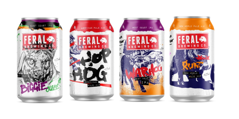
From humble beginnings in the Swan Valley to the trailblazing brewery that stands today, Feral sought out to truly represent the full flavoured, aggressive and distinctively Feral brews that go into each of our cans, by modernizing the packaging to reflect where we are today.
The refresh shows off our growth from where we started to where are, and where we are headed with subtle changes that filter through across the range and fully encapsulate our “Brewed by Instinct” mantra in colour, texture and design.
Developed and designed with frequent collaborator Peche (Dipesh Prasad), responsible for our iconic Biggie Boar and the recent Runt design, together we really honed in on what elements to strengthen, reinterpret and to create from new. For the design process we wanted to achieve a strong level of consistency for the brand whilst simultaneously showcasing the uniqueness of each brew and character.
“With the brewery and lineup evolving over the years we needed to refine the consistency across the range.The signature brand aesthetics of torn paper, hand lettering & illustrations still remain strong, but with the departurefrom the brewpub, the range of farmhouse characters has seen a gradual evolution into larger, beasts with more character to reflect the personality of the brand and the beers.”
“One challenge has been aligning the aesthetics of popular seasonal releases into the core range. When the graphics of releases such as Warhog were created (over a decade ago), the intention of the design was to visually be opposite to the core in regards to colours, structure & guidelines. This was to create a clear differentiation between core & seasonal beers. The refresh sees an update to colours, consistency across the logo/details, and a clearer vision of rollout for future releases. With all our new ducks (or hogs) all in a row, we couldn’t be prouder of what’s to come!”
The most notable change overall is to Hop Hog. Gone is the cut and paste pig, and in its place, a boar that better represents the big hoppy and bitter award winning liquid we love.
The designs harken back to the original proposition of Feral and its creation 20 years ago with the goal of developing something undomesticated, yet sophisticated.
Warhog has also received changes. Having started out as a seasonal release before making its way into the core range. Even when it joined the core lineup the changes still didn’t cohesively come together with the rest of the range, but now it’s time to make it feel at home.
Even Biggie didn’t escape the refresh. We’ve made our biggest selling beer even bigger, literally. The Biggie Boar takes up a larger portion of the can face now. It’s also where we’re pulling the coloured rips from on the top each can, paying homage to our brand history while charging head on into the future.
“The team have put an immense amount of work into the portfolio format and brand artwork over the past 12-24 months. We want our brand to be so unique and identifiable that if you were to take our Feral logo off our beers, you’d still know what you are drinking, and I think the team have nailed that” Rob Brajkovich, Feral General Manager.
You will start to see the new look packaging coming through from July. Plus coming out in October is a new exciting addition to the range…….Keep an XTRA close eye out for that.

